2026-07-29 · 7 min read
Image Compression, Resize, and Format Checklist Before Publishing
A practical checklist for preparing screenshots, product images, and blog graphics with image resizing, compression, and quality review.
Search intent
For users preparing images for websites, blogs, product pages, support docs, or social previews before publishing.
Key takeaways
- Start with the display size before changing compression quality.
- Keep one original file and export smaller publishing copies.
- Compare visual quality at the size users will actually see.
- Use local tools for lightweight image preparation when files do not need team storage.
Tool workflow
Check the real display slot
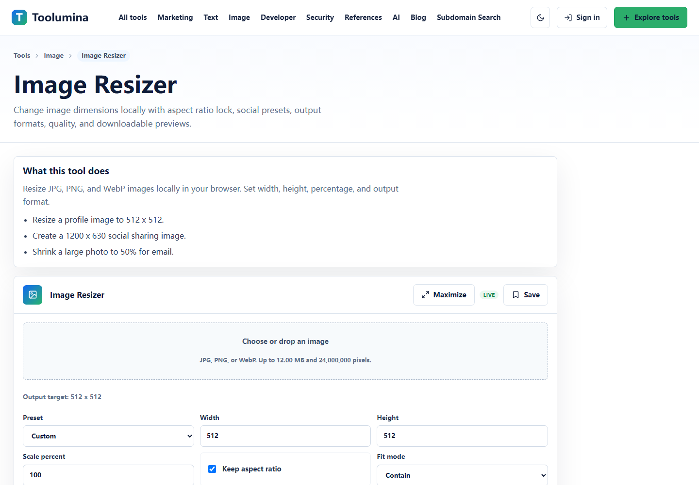
Measure the largest place where the image will appear. A blog card, help article screenshot, product thumbnail, and full-width hero all need different output sizes.
Image ResizerExport a publishing copy
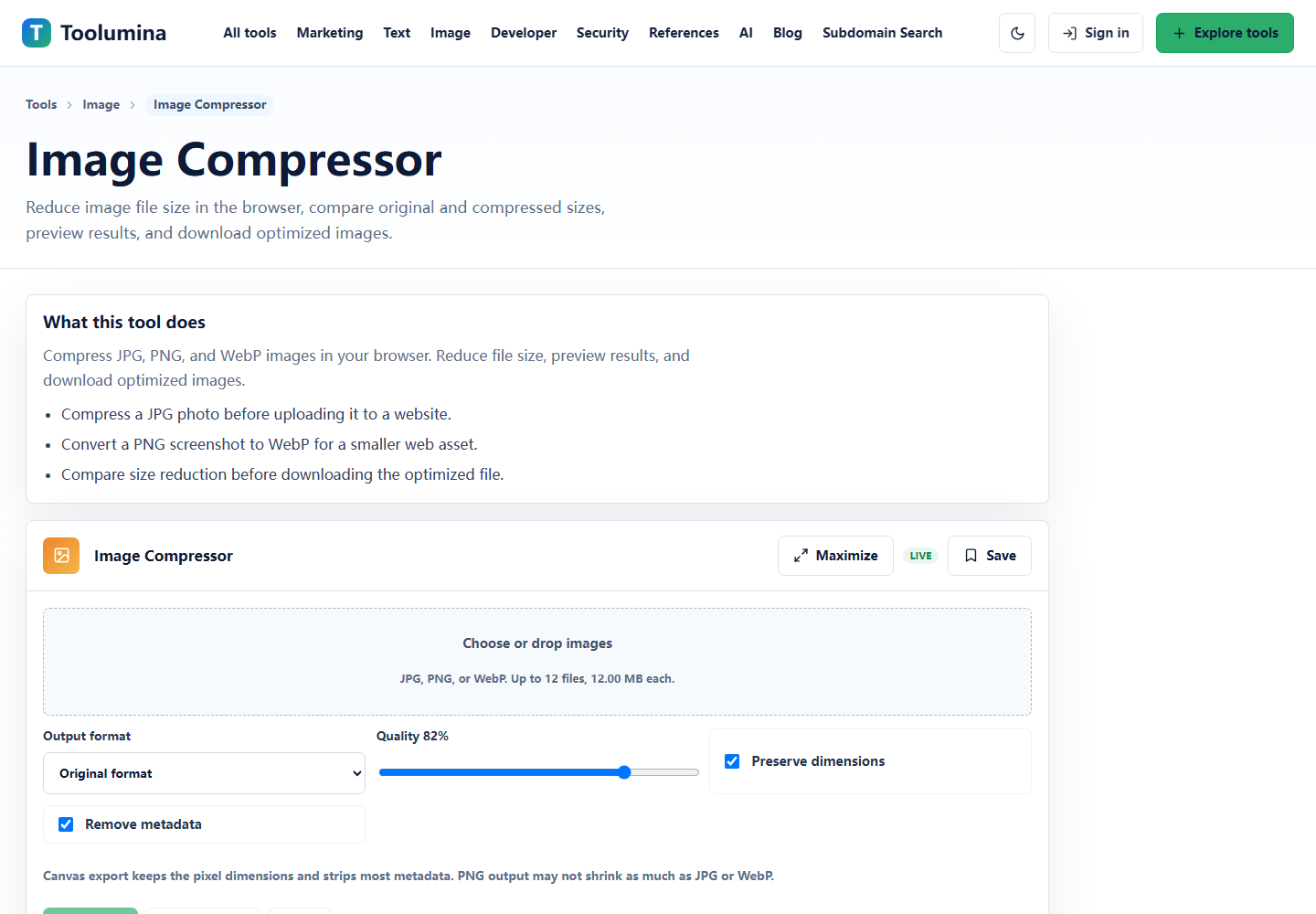
Resize the image first, then compress a copy for the web. Keep the source file unchanged so future crops, retina versions, or print exports do not depend on a previously compressed file.
Image CompressorReview quality in context
Open the final image near the same width users will see. Look for blurry text, crushed gradients, noisy backgrounds, and artifacts around icons before uploading it to a page.
Image CompressorScreenshots from the workflow
Use dimensions before quality sliders
A large phone photo or full desktop screenshot can be several times bigger than the space where it will appear. Lowering the quality slider alone may still leave a file with unnecessary pixels.
Start with dimensions. If a screenshot will appear inside a 720 pixel article column, exporting a 3200 pixel wide image creates extra download cost without improving the reader experience.
- Blog body screenshot: match the article column width.
- Product card: export a smaller crop with a stable aspect ratio.
- Hero image: create a deliberate wide crop instead of relying on CSS to hide important content.
Pick format from the image type
Screenshots with text, UI panels, or flat colors often need crisp edges. Photos and textured images can usually tolerate more compression. Logos, icons, and transparent graphics need special care because the wrong format can add background boxes or fuzzy edges.
The practical rule is simple: preserve clarity where users need to read or inspect details, and compress more aggressively where the image is supporting context.
- Use PNG when small UI text or transparency matters.
- Use JPG for photo-like images where file size matters more than exact pixels.
- Use WebP when the publishing platform supports it and you have checked fallback behavior.
Review the final page, not only the file
Image optimization is not finished when the downloaded file is smaller. It is finished when the final page still looks clear, loads quickly, and does not crop away the part that explains the task.
After uploading, check desktop and mobile. Many image problems only appear when a card crops the image, a caption wraps, or a screenshot shrinks below the point where labels can be read.
Background notes
Keep source and output files separate
A clean image workflow keeps an original source file, one edited master if needed, and publishing exports for specific surfaces. That makes later updates easier and avoids repeated compression damage.
Naming exports by use case helps too: article-hero, docs-inline, social-preview, or product-card tells you why the file exists.
Local image tools are useful for lightweight preparation
Browser-local resizing and compression are useful when the job is quick preparation, comparison, or export. If the workflow needs shared review, asset history, or brand approval, use the team's normal design or DAM process.
For quick tool pages, support docs, and blog drafts, a local utility can remove friction while keeping source files on the device.