2026-07-31 · 8 min read
Useful Utility Pages Need More Than a Form: A Quality Checklist
A practical checklist for making online utility pages more useful with examples, workflow context, privacy notes, limits, and related tools.
Search intent
For builders, marketers, and creators who publish utility pages and want them to be useful beyond the interactive form itself.
Key takeaways
- A useful utility page explains the task, not only the controls.
- Examples, limitations, privacy behavior, and related workflows add real value.
- Screenshots and task-specific notes help users decide whether the tool matches their job.
- Publishing fewer, stronger pages is usually better than exposing hundreds of thin pages at once.
Tool workflow
Describe the real task
Start the page with the job the user is trying to finish. A converter, validator, generator, or checker should explain the situation it helps with, not only the input format.
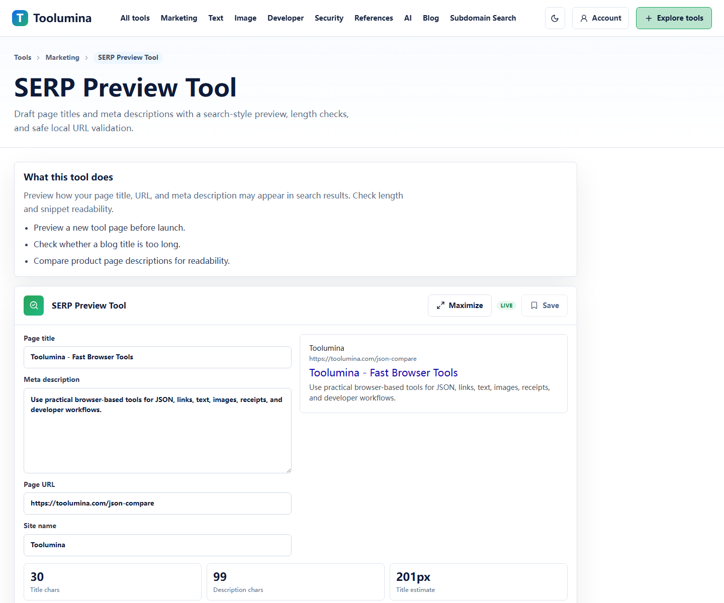
SERP Preview ToolShow examples and limits
Add realistic examples, edge cases, and limitations. This prevents users from treating a simple browser tool as a source of truth for problems that need verification.
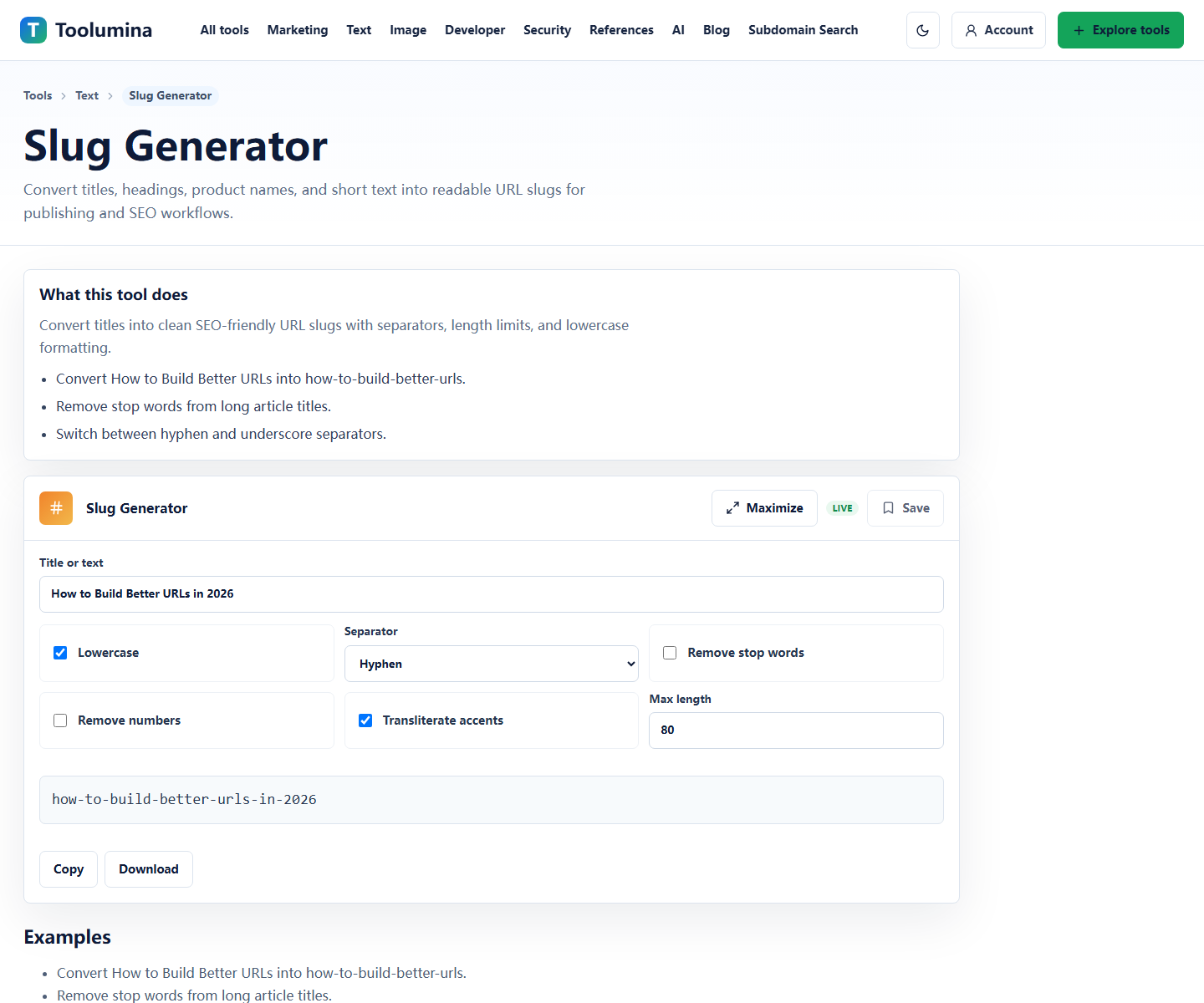
Slug GeneratorConnect the next step
Link to related tools or workflows when the output usually feeds another task. A useful page helps users complete the chain, not just one isolated action.
UTM BuilderScreenshots from the workflow
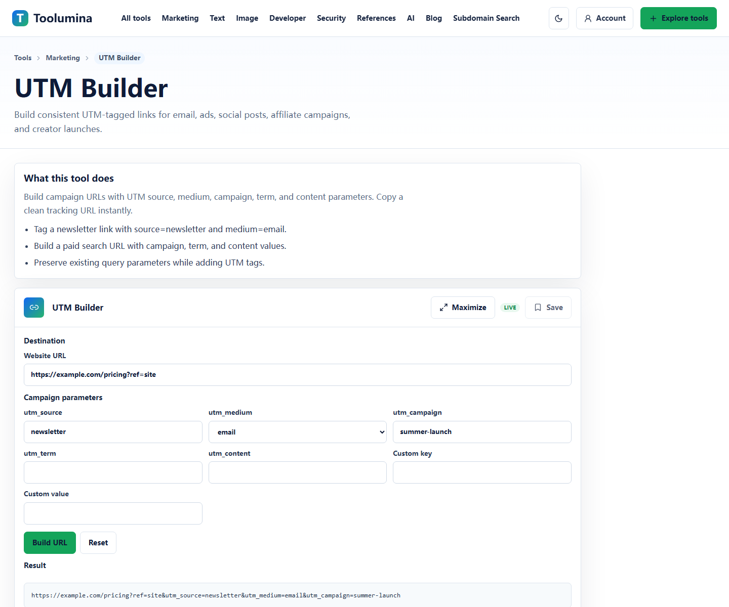
The form is only the center of the page
A tool page can be technically functional and still feel low value if it only contains a form, a short sentence, and a few repeated keywords. Users need to know when to use the tool, how to interpret the output, and what the tool does not prove.
The strongest utility pages combine an interactive surface with practical context. The controls finish the immediate task, while the surrounding content explains examples, edge cases, privacy behavior, and follow-up steps.
- What the tool does in plain language.
- Who the tool is best for.
- Example inputs and outputs.
- Known limits or cases that need manual review.
- Related tools for the next step.
Avoid exposing too many thin pages at once
Large reference collections and generated pages can be useful, but they should not overwhelm the site before the core pages have enough depth. A new utility site is easier to understand when its sitemap highlights the strongest pages first.
A practical launch pattern is to index the home page, tool index, policy pages, workflow pages, blog posts, and a smaller group of best tools. Additional reference pages can be expanded after the site has clearer topical depth and user signals.
Write from use cases, not keyword variations
A helpful article or tool page starts from the user's job: clean JSON before debugging, resize a screenshot before publishing, build a QR code for a printed receipt, or compare two versions of a config file.
Keyword variations are easy to generate. Useful context is harder because it depends on workflow knowledge, examples, and honest boundaries. That is the difference users feel when a page answers the next question instead of repeating the same phrase.
Make privacy behavior visible
If a tool processes text or files in the browser, say that clearly and explain the remaining practical caution. Users still need to avoid pasting production secrets, private keys, regulated records, or sensitive customer data into any public website unless policy allows it.
Privacy notes are useful content because they help the reader decide whether the page is appropriate for their task.
Background notes
Drafting method is not the core issue
The quality problem is usually not how a draft started. The problem is whether the finished page is generic, scaled, unreviewed, or missing original value.
A stronger process adds human review, hands-on checks against the tool, examples from real workflows, screenshots, limitations, and clear ownership of the page.
- Use outlines and templates as a starting point only.
- Add original examples and workflow judgment before publishing.
- Review the page against the live tool behavior.
- Publish on a steady schedule instead of releasing a large batch of similar pages.
A simple utility page review checklist
Before publishing a new utility page, read it as a first-time visitor. If the user can understand the task, trust the limitations, and choose a next step, the page has a stronger chance of being genuinely useful.
If the page feels interchangeable with dozens of other generic tool pages, add more specific examples or hold it back until it earns its place in the index.